Tuesday, March 20, 2012

Mapping the Anthropocene

The 5th of March 2012 marks the 500th birthday of Gerardus Mercator, the creator of the world map that profoundly changed our views of the world. He was not the only one who worked on a conformal map projection in the 16th century, which was still an age of exploration and discovery. But he was the first to do the maths right and complete a world map that allowed ships to navigate around the planet by its ability to represent lines of constant course. That makes the Mercator projection a milestone in the history of cartography and remains one of the central map projections up to the present day. The Mercator projection, however, is not always the most appropriate projection. It is useful in nautical issues, but far less suitable for map purposes in which distances or areas are in the centre of interest. When misunderstood, using a Mercator projection can even lead to some awkward misinterpretations: An infamous example is a map drawn by The Economist showing North Korean missile ranges drawn in circles on a Mercator map. A vast amount of projections has been developed since Mercator released his iconic map in 1569, mostly trying to find the optimal solution to “preserve some properties of the sphere-like body” (see a comprehensive overview of map projections at Wikipedia). Far less consideration so far has been given to the question of different spaces. The spatial turn has been widely discussed, not only in the circles of human geography. Far less thoughts have been spent on an adequate visual representations of new understandings of space as a result of processes of globalisation and global change.

Geologists and environmental scientists have shaped the term Anthropocene for the impact that humanity has on the physical environment. Crutzen speaks of the geology of mankind, which highlights the relevance that our species has in the transformation of nature. The concept has also found a wider attention in the media recently (see e.g. these articles from the BBC and the NYT), showing that the issues related to the idea are becoming ever more pressing for the future of humanity. As stated in the New York Times, “Humans were inevitably going to be part of the fossil record. But the true meaning of the Anthropocene is that we have affected nearly every aspect of our environment — from a warming atmosphere to the bottom of an acidifying ocean.”

Cartography appears to be predestined to show these issues in visual form on maps. The educational Globaia project is one interesting example that produced some stunning imagery of human activity. Like other maps, it uses conventional map depictions in its approach, which may help in understanding the underlying issues, but is not particularly novel. The claim that I made as a result of my doctoral research is that we also need new cartographic concepts to fully understand the full extent of human-environment relationship and to fully comprehend the age of humankind. Mercator had a great impact to lead us into a globalised world, but we are no longer in an age of exploring unknown places, rather than an age of discovering alternative pathways into our own future.

In my plenary speech to the Population Specialty Group at this year’s AAG conference in New York City I showed a map that was made in collaboration with Globaia, showing some key indicators of human activity on the planet projected on a gridded population cartogram projection. The following map shows one example for such an attempt to redraw the impact of humanity on those spaces where people live. The map gives equal space to every person living on the planet, while preserving the geographical reference of the additional layers that are shown on the map. The issues depicted in the map include night lights, major roads, railways, power lines, pipelines, overseas cables, air lines and shipping lanes (see a full account of the data on the Globaia website). Many of the issues have been shown as individual maps on this website or in my PhD thesis, but this map brings some of the key aspects of human (inter)activity on earth together and shows them on an equal population projection:


My talk concluded in a slightly bold manner: Is it too much of an aspiration to take the chance of celebrating Mercator’s 500th birthday by changing our mental map of the world from one that guides ships to one that guides our journey into a more sustainable future for humanity?

Mercator’s map was a great achievement, but we should not forget to move on and find new ways of thinking about our world. A map cannot change the world, but maps can change the way we view the world. It is about time to change our views to see how we can live our lives a bit less stupid to make our impact a bit more sustainable, and create a more equal world for every person living on this planet. Gridded cartograms are not the only way to draw new maps, but stand for one possibility to rethink our view of the world. A gridded population cartogram can therefore be one new basemap for a cartography of the Anthropocene.

The map on this page has been created by Benjamin D. Hennig of the SASI Research Group (University of Sheffield) in collaboration with Globaia. Feel free to use the maps on this page under Creative Commons conditions (CC BY-NC-ND 3.0); please contact me for further details – I also appreciate a notification if you use my maps. High resolution and customized maps are available on request.

Written By :-  Benjamin D. Hennig at the University of Sheffield. (Blog of the author)

Thursday, March 15, 2012

Build a simple GIS web application using GeoDjango and Google Maps

Django is a high-level Python web framework that encourages rapid development and clean, pragmatic design.


Wednesday, March 7, 2012

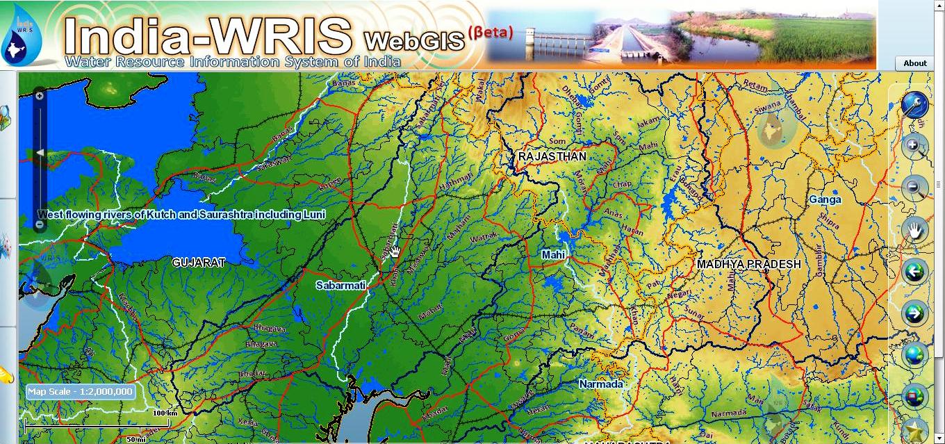
The India-WRIS project

The India-WRIS project is a joint venture of Indian Space Research Organisation and Central Water Commission.It aims to develop an online, user friendly application that shall bring all information related to the water resources of the nation at single window wherefrom all the interested users can obtain it and make use of it. The vision of the project is to make available all water resources related data in standardized GIS form to the user community by achieving the objectives of creating and collecting all such data available through various sources. It's scope includes the generation and collection of data pertaining to 30 geospatial layers whose comprehensive information will be provide to the end user. This information will be dessiminated to the end user through a web based geo-spatial application which forms an integral part of the deliverables. The proposed web application will be released in a 2D-application form and also with the 3D View.

For accessing portal click here

Tuesday, February 7, 2012

TileMill: Open Source Mapping Now for Windows

TileMill is built on open source libraries (Mapnik, node.js, backbone.js,express and CodeMirror) and uses CSS styling with its map styling language Carto to render beautiful online maps. For an idea of what you can do with TileMill, the Chicago Tribune demonstrated some of its capabilities in its Making Maps series using PostGIS, Mapnik, TileMill, and Google Maps. Demos of TileMill in action can also be viewed on MapBox’s Maps page.

TileMill can now be used natively in Windows with the latest release. The release of TileMill 0.9.0 also includes a new plugin system: “TileMill UI can now be extended and modified using standalone, JavaScript plugins.” The new release also includes many fixes and updates including shipping with a desktop app client instead of requiring a browser.

TileMill has also released a crash courseto help new users walk through using the open source application. The course reviews:, Importing a basic spreadsheet, Styling a basic point map, Adding tooltips and legends, and Exporting maps and sharing them on the web.

For Downloading TileMill Please Click here


MapNimbus - Online Mapping Portal

MapNimbus is an online mapping portal designed to deliver information to citizens in an easy-to-use interface. Web Mapping Application by GeoTechGroup

CRIME MAPPING

MapNimbus boasts a familiar and intuitive interface that is easy-to-use. MapNimbus allows the user to search by address or agency to view crimes in their area. The user can narrow the scope of the search by using a pre-defined buffer. The crimes can be narrowed down even further by specifying a specific date range that you wish to view. To view more information about a specific crime, just click the icon and a map tip will display relevant information about the crime. Online crime mapping is made easier with MapNimbus.

SEX OFFENDERS 

MapNimbus allows the user to view sex offender data for their area. This allows you to keep the public informed of any registered sex offenders residing near their home, work, daycare, school, parks, public library, etc. The user can search for sex offenders near an address. You can click on the sex offender icon and view information about the offender on the mapping interface. MapNimbus also allows the user to click a link and visit the state's sex offender site directly for more detailed information.

RESTAURANT GRADES, CODE ENFORCEMENT, OCCUPATIONAL LICENSING, BUILDING PERMITS, TATTOO PARLORS, ADULT CARE FACILITIES, CHILD CARE FACILITIES, LODGING, POOLS AND SPAS, AND NURSING AND REST HOMES 

MapNimbus informs the public of relevant and important information. When in need of restaurant sanitation grades, lodging grades, child care facility grades, and more look no further than MapNimbus! The easy-to-use interface allows the user to seach by address or pan and zoom the map to the desired location. You can view the inspection date, score and letter grade for each restaurant or view information about building permits in your area. MapNimbus also displays historical grades as well as the current grade for the restaurant. You can sign up for automatic email notification to be notified when sanitation grades change for a user-specified area. MapNimbus allows the user to view a wide array of information about their community. MapNimbus helps you keep citizens informed!

STATISTICS AND REPORTING 

Not only can users view crimes and restaurant data for their area, they can also use powerful statistic and reporting tools to view a summary of the occurrences in their area. The reporting tools show a summary of what is being viewed on the mapping interface, whether it be crimes, restaurant grades, or other data. The user can also view a summary of the entire agency.You can choose to view a pie chart, bar chart, or tabular data. As you pan and zoom the map, the charts automatically update to reflect what you are viewing on the map. Once you have the sample of data that you desire, you have the option to print the information.

EMAIL NOTIFICATION 

MapNimbus allows users to sign up to receive automatic email notifications for changes in their area. They can receive an email when a crime has occurred within a specified distance of the address they choose or when a restaurant grade changes within the area they specify. This allows the public to automatically be notified of important information in their area!


Tuesday, January 31, 2012

Frozen Planet

Frozen Planet: Explore the Polar Regions features an interactive display through which you can view the history of polar exploration and the science of the polar regions. The interactive display is created through the use of the Google Earth browser plug-in and a timeline. You can click along the timeline to see and read placemarks on Google Earth. You can browse through and click on a list of important places in both polar regions. For further investigation and analysis of the polar regions you can activate a number of Google Earth layers within the Frozen Planet display. The display also includes videos about each region although the playlist for the Antarctic region is much longer than the playlist for the Arctic region.

Applications for Education Frozen Planet: 
Explore the Polar Regions could be a good resource for both science and history teachers. In fact, Frozen Planet could be the basis for an interdisciplinary unit at the middle school or high school level.

Here's a fun fact that I learned through Frozen Planet: Explore the Polar Regions, five years after being the first person to stand on top of Mount Everest Sir Edmund Hillary was part of the team that completed the first complete crossing of Antarctica .

See the GIS Interface by Clicking here


Sunday, January 29, 2012

Geospatial Hydrologic Modeling Extension (HEC-GeoHMS)


The Geospatial Hydrologic Modeling Extension (HEC-GeoHMS) has been developed as a geospatial hydrology toolkit for engineers and hydrologists with limited GIS experience. HEC-GeoHMS uses ArcView and the Spatial Analyst extension to develop a number of hydrologic modeling inputs for the Hydrologic Engineering Center‘s Hydrologic Modeling System, HEC-HMS. ArcView GIS and its Spatial Analyst extension are available from the Environmental Systems Research Institute, Inc. (ESRI). Analyzing digital terrain data, HEC-GeoHMS transforms the drainage paths and watershed boundaries into a hydrologic data structure that represents the drainage network. The program allows users to visualize spatial information, document watershed characteristics, perform spatial analysis, and delineate subbasins and streams. Working with HEC-GeoHMS through its interfaces, menus, tools, buttons, and context-sensitive online help allows the user to expediently create hydrologic inputs for HEC-HMS.

HEC-GeoHMS can also generate tables with information on the physical characteristics of water bodies and watersheds. This information is useful when estimating hydrologic parameters.

Additional features include:
  • Data Management: This feature aids in managing the locations of different projects and can also be used for error checking and detection
  • Terrain Preprocessing: This can be done in two modes: step-by-step or batch. In step-by-step mode, the user can examine the model outputs and modify the data set as needed. If the user is confident in their data set, they can opt to run this feature in batch mode which eliminates additional steps and runs unattended.
  • Basin Processing: The user can divide the basin into subbasins (or merge subbasins together) with the results displayed instantaneously. This allows the user to make modeling decisions on the fly, rather than waiting until the end to run the model and then make modifications.
Basic Inputs:
  • Watershed and subbasin information (boundaries, sizes, stream locations, etc)
  • Pre-preared data to apply over the watershed grid
  • Topographical features and drainage information
Basic Output:
  • Spreadsheets and datasets describing watershed and subbasin characteristics
  • Spatial analysis result datasets
  • 2-D and 3-D images including topography, and stream and water body locations
  • Data that can be imported for simulations run in HEC-HMS
How to Run the Model:
  • Import or construct a watershed with subbasins. You can import a file made with HEC-HMS, or use HEC-GeoHMS to build a new one.
  • Modify the watershed, subbasins, and their characteristics as needed
  • Import pre-assembled data to associate with the site. Be sure that the data is compatible with GIS data structures. If you are unfamiliar with GIS data analysis methods and techniques, you may wish to read over some examples in the HEC-GeoHMS users manual.
  • Run a simulation/ perform you analysis and view the results. You may also export the data to HEC-HMS to perform additional hydrologic modeling
Download From Mediafire  password: engineeringsofts.com